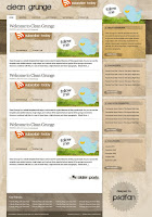
This tutorial will cover the steps of designing the Clean Grunge blog design from scratch. It also discusses the techniques and styles of this kind of web design.
Step 1
Open up a new document (1050x1500px). This won't be the width of our main layout, but will take into account parts of the background to the side of our main content areas. Create a new layer set called 'background' and create a new layer called 'main background color'. Select all (option+a) and fill this layer with a light cream color (ECE5D9).

Step 2
Now open up a new document (960x1200px). 960px is the perfect width to accommodate for everyone using a 1024X768 screen resolution, as you don't want to risk side scrolling. In your new document create a new layer and use your rectangular marquee selection tool to select the left 3/4 of your canvas. Fill this with white. Then select the remaining right 1/4 of the canvas using your magic wand tool. Fill this with medium gray. Then select this entire layer and return to your original document. Grab your zoom tool and right click+fit on screen. Then paste in your white/gray image. This should paste the image directly into the center of your canvas.

Step 3
Now select you 'main background' layer and create a new layer called 'header dark'. Select near top part of your canvas (leaving a light area right at the top) and fill your selection with a dark brown color (928673). Hide your white/gray shape layer as we'll be working solely on our background for now.

Step 4
Download a free paper texture and paste this into your document onto a new layer above both of your current background layers. Full size the texture is a little blurry so go to filter>sharpen>sharpen more. Then set the layer blend mode to 'multiply' and reduce it's opacity to 50%.

Step 5
Select your header dark' layer and use your magic wand tool to select the light area above and below it. To have both selections active at the same time hold shift when making your second selection, in order to keep the first selection active. Then return to your paper texture layer and go to image>adjustments>brightness/contrast. Increase the brightness to +100 and reduce the contrast to -75.

Step 6
Now download the awesome free brush set Ink and Splatters from Q Brushes. Create a new layer above your paper texture layer called 'ink splatters' and set it's blend mode to 'overlay' and opacity to 50%. Then apply various brushes from the set all over your canvas. You don't need to apply them too much in the center of your canvas as this will be covered by your content area. Mainly apply them around the edges of your canvas and in the header area.

Step 7
The brush marks over the dark brown bar area are too bold compared to the background. To fix this return to your 'header dark' layer and select the dark bar using your magic wand tool. Then return to your ink splatters layer and use a very large eraser brush (50% opacity) to brush over the entire bar, reducing the brush marks opacity in this section by half.

Step 8
Now if you remember earlier we pasted in our white/gray shapes image into this document and made the layer invisible. Make the layer visible again, and then create a new layer set called 'main area'. Select the white rectangle using your magic wand tool, and then copy/paste it onto a new layer in your 'main area' layer set. Then hide the white/gray guide layer again.

Step 9
We want the layout to line up nicely, as consistent lines are important in any design (even a grungy one). So I move up my white content area to line up with the dark brown bar. Then I type out some menu items above this (font: Arial, size: 11pt, color: 3B3026, kerning: -50). Then I create a layer called 'menu hover' below my text layer and create a white rectangle behind my 'home' link to create a tabbed effect.

Step 10
This step is very important, as it creates definition and structure, but also great grungy detail. Use your line tool to draw 1px black lines around your white content area and menu tab, creating a border effect. Each line shape will be created as a different layer and a vector shape. You'll need to rasterize each line layer and merge them all down into one single layer. Then use your eraser brush to erase away parts of your border, to give a really messy outline to your content area. To achieve this make sure to use one of the ink splatter brushes as your eraser brush and reduce it's opacity to 50%.

Step 11
Now create a new layer set beneath your main content area layer set called 'sidebar 1′. Make your white/gray guide layer visible again, and create a new layer in your 'sidebar 1′ layer set called 'sidebar bg'. Create a rectangular selection the same width as the gray area in your guide layer and fill it with a medium brown (B8A689). Then repeat the same technique used to give your main content area a rough outline on this sidebar area.

Step 12
Now download a free Cardboard Texture. Copy/paste it over your sidebar area layer and then resize it to fit perfectly over it. Then change the layer blend mode to 'overlay' and reduce it's opacity to around 80%.

Step 13
Now select your rounded rectangle tool and set it to a radius of 15px. Then draw out a rounded rectangle shape near the top of your sidebar area. Reduce this layer's opacity to 20% and rasterize it. Then use your ink splatter eraser brush to erase away parts of your rounded rectangle, making it look more grungy. Then add in some heading text, and also content within your sidebar box. For the learn more button I used a low opacity ink splatter brush to give it a grungy backdrop. I also used one of the ink splatter brushes to give a little extra detail to the bottom right corner of my sidebar box.

Step 14
Now the beauty of having all the layers for this sidebar box in one layer set is that now we can right click on the layer set and click 'duplicate layer set'. Then simply move the duplicated layer set 20px beneath the current one. This is the basis for my other sidebar content, but I want this box to be less bright and obvious, as often the top sidebar box is designed to capture the most attention. To make this second box more subtle I select my 'sidebar bg' layer within the layer set and then go to image>adjustments>hue/saturation. Then I reduce the saturation to -75 and up the brightness to +25.

Step 15
Now keep duplicating layer sets until you have enough boxes in your sidebar. This is a good point to look over your layout as a whole and try to find areas that aren't looking quite right. For me, the bottom right background brush strokes were a little too bold, and were detracting away from my sidebar content, so I went in with a 50% opacity eraser brush and softened them up a little.

Step 16
Now create a new top layer set called 'header'. Select a grungy or handwritten font. I went with 'Green Piloww' which you can download free here. Then type out a nice grungy looking logo.

Step 17
Now go to your custom shapes panel and select the shape that looks like grassy reeds. Draw out this shape just above your top sidebar box, and make it a light, bright green color (C4FA44). Then rasterize it, and go to edit>transform>define brush present. Call your brush 'grass brush'. IMPORTANTLY: be sure to hide all other layers (do this by turning off the visibility on all your layer sets), except for the layer set containing your grassy shape. This is so that when you define your brush shape it will only pick up the data from this shape.

Step 18
Now go to your brush options menu and select your 'grass brush' brush. Select scattering, and then input 206% scatter, with count: 1, and counter jitter: 24%. Then select 'shape dynamics' and input: size jitter: 0%, minimum diameter: 100%, angle jitter: 0%, roundness jitter: 0%. Now delete your original grass shape, and create a new layer called 'grass light'. Then paint in the grass just above your top sidebar box. For some reason the brush marks are very faint, so to fix this I duplicate my brush marks layer 10 times, and merge all of these layers together.


Step 19
Now create a new layer called 'grass medium'. Draw out some more grass using the techniques in the last step, but this time make your grass color 94C51E. Then create another layer called 'grass dark', and paint in some more grass (5D800A). Then finally use your rectangular selection tool to delete the parts of the grass on each layer that overlap into the content areas.


Step 20
Now I download a fantastic free Twitter character icon offered at We Function. I fit this character into the grass, and then to make the top of the bird stand out a bit more against the light header background I apply a subtle inner shadow.

Step 21
Now I move my Twitter bird to the right a little and make way for a speech bubble. I create a white speech bubble, and then using my logo follow write out 'follow me' to complete the Twitter section of my header. To make my speech bubble stand out a little more I apply the same inner glow that I applied to my Twitter bird. To do this I right click on the Twitter bird layer and click 'copy layer styles', then right click on the speech bubble and click 'paste layer styles'.

Step 22
Now create a new layer set BEHIND your 'twitter' layer set. Call this layer set 'rss area'. Grab an RSS icon (I just googled this) and paste it onto a new layer ('rss icon'). I move the icon so that it appears to be emerging from the top of my layout. I also rotate it by going to edit>transform>rotate. Then I apply a drop shadow to give the impression of depth (settings below).

Step 23
Now I find a great photo of some torn cardboard and paste this onto a new layer BELOW my rss icon layer. To hide the white parts of the image I set my layer blend mode to 'multiply'. Then I rotate the cardboard to fit nicely at the top of my header, and finally add some subscribe text using my logo font.

Step 24
Now create a new layer set called 'blog post 1′. Add in the content for a blog post over the main white area of your layout. Be sure to use a large, clean font for your post title (I went with Georgia). You can obviously present your content however you like, but the aim of this tutorial is to show you how to create an attractive framework for such content.
To create the grungy line beneath my blog posts I used the same technique as I used to create my rough borders. Simply draw out a black line and erase it using the ink splatter brush eraser.
The reason for putting the blog post in it's own layer set is because it allows you to duplicate this layer set and copy out more blog posts very easily, to act as fillers until you code your layout.

Step 25
Now return to your background layer set. Duplicate your dark brown bar layer and move the bar down to the area below your main white content area. Go to edit>transform>scale and scale it to fit nicely below your main content area. The paper texture and ink splatter brush marks should be on layers that are above this duplicate layer, so the ink splatter marks are too obvious, just as they were with the original dark bar. To fix this repeat the technique shown earlier - select your dark area using the magic wand tool, and then select your ink splatter marks layer and use a 50% eraser brush to erase over the ink splatter marks. This should tone them down. Also repeat the technique used to draw out the rough lines and borders in the rest of the design, and give the dark area a nice grungy border.

Step 26
Now create a new layer set called 'footer'. Fill in your dark footer area with text. For the copyright bar select your dark footer area and go to image>adjustments>brightness/contrast and reduce the brightness to -40.

Step 27
Now we want to give the impression that the left column of the layout is in front of the sidebar, and that the sidebar boxes are really just tabs of this main area. To do this, I want to create a little depth. I create a new layer set between my sidebar layer sets and left column layer set called 'main area shadow'. Then I use my marquee tool to make a long selection, about 5px wide spanning the entire length of the white content area, just to the right of it. I fill this with black, and then reduce my layer opacity to 10%.

Step 28
To finish up I add a couple more simple details near the bottom of my layout.

And We're Done!
I really hope you enjoyed this tutorial, and would love to hear your comments on it. You can click the image below to view the full-sized layout.

Images+Extras Used
This is a quick references for all photos, textures and brushes used in the making of this design.
Free Paper Texture
Ink Splatters Brush Set
Cardboard Texture
Free Twitter Character


अच्छी जानकारी !! आपकी अगली पोस्ट का इंतजार नहीं कर सकता!
ReplyDeleteद्वारा टिप्पणी: muhammad solehuddin